Shutdown Panic vs Market History: What Actually Happens to the S&P 500?

Every time Washington edges toward a government shutdown, the same headlines hit:
“Market chaos ahead”, “Investors brace for turmoil”, “Risk-off mode”.
So we asked a simple question: what has actually happened to the S&P 500 after past shutdowns?
Instead of trading the narrative, we let the data speak.
Which shutdowns did we look at?
We focused on modern U.S. government shutdowns that involved furloughs – periods when parts of the federal government really did shut their doors and workers were sent home.
The sample includes:
- 1980 – Jimmy Carter (FTC shutdown)
- 1981 – Ronald Reagan
- 1984 – Ronald Reagan
- 1986 – Ronald Reagan
- 1990 – George H. W. Bush
- 1995 (Nov) – Bill Clinton
- 1995–96 – Bill Clinton
- 2013 – Barack Obama
- 2018 (Jan) – Donald Trump
- 2018–19 – Donald Trump (longest shutdown on record)
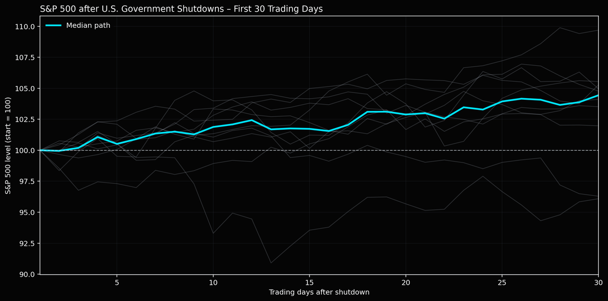
For each episode we took the day the shutdown ended, then tracked the S&P 500 from the first trading day after re-opening.
Method: 30 trading days after the re-opening
To make the paths comparable:
- For each shutdown, we tracked the S&P 500 for the next 30 trading days.
- We rebased each path to 100 on Day 1, so the chart shows percentage-style moves rather than index levels.
- All individual shutdown paths are plotted as faint grey lines.
- On top, we plotted the median path as a bright cyan line – this is the “typical” market reaction across all episodes.
No fancy factors, no model complexity – just price history after every major shutdown.
What the chart shows
The result is surprisingly calm:
- The median S&P 500 path drifts higher, not lower.
- Over the 30-day window, the median line ends roughly 4–5% above its starting point.
- Some episodes were clearly weak (you can see those grey lines dipping), but they’re the exception, not the rule.
- The bulk of shutdowns were followed by orderly grind-ups, not crash regimes.
In other words: historically, shutdowns have looked more like “noise” than structural regime shifts for equities.
Why might markets behave this way?
A few reasons why the historical reaction is milder than the headlines:
- Shutdowns are usually well telegraphed.
By the time the government actually closes, markets have already priced much of the risk. - Most shutdowns end with a deal.
The moment there’s a pathway to compromise, investors quickly refocus on growth, earnings and the Fed. - The real economy impact is often temporary.
While painful for workers and agencies, the macro hit has usually been small and later reversed.
That doesn’t mean shutdowns are irrelevant – especially for confidence and politics – but the S&P 500 has historically treated them as short-term noise rather than a lasting shock.
The important caveats
A few things to keep in mind before anyone turns this into a “shutdown strategy”:
- The sample size is small (a handful of episodes over ~40 years).
- Each shutdown happened in a different macro backdrop – inflation regimes, Fed policy and valuations were not the same.
- The worst paths in the chart remind us that not every episode was friendly for risk assets.
History is a guide, not a guarantee.
Takeaway
When the next wave of shutdown headlines hits your feed, remember what the data says:
Across the modern era, the “typical” S&P 500 reaction after a U.S. government shutdown has been a slow grind higher – not a collapse.
That doesn’t remove risk, but it does frame the narrative.
Use the panic, respect the data, and always size your risk accordingly.